Client: Tailored Co.
Role: UX/UI design, Visual Design
Team: Jessa Andre & Lily Yang
Tools used: Figma, Photoshop
How Boosting consumer’s confidence in online clothing purchases also increases the fashion e-commerce revenue.
240$ billion dollars worth of clothing is purchased online each year and it is estimated that 40% of what people buy online is returned, mostly because of sizing issues, said Time magazine. It is a hassle for the shoppers and expensive for the retailers. So we set out to solve this problem. With a team of 5, we tried to solve this dilemma of business return and customer buys.
Tailored Co. is currently in development using our redesign on their current interface.
How B2B ReDesign to D2C boosts Revenue Online
Tailored Co. is a company that has developed a way for you to measure a garment with the use of their AI technology. They currently have a product that is B2B and are in the process of a redesign to allow for a D2C product so that anyone will be able to purchase to use it off of their website.
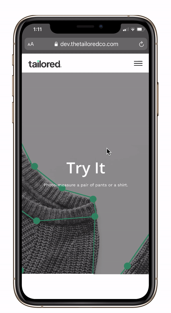
How tuning up aesthetics increases engagement for users
Our goal was to focus on creating a platform that is visually pleasing and more interactive for the user. Our goal was to tune up the interface, have a less rigid flow, and have a more intuitive experience for the user.
Research
Multi-Variate Qualitative Testing
As a group, we conducted secondary competitor research by focusing on the usability, and trends of similar applications. We also interviewed the companies current clients and new users on the current interface.
Usability Testing
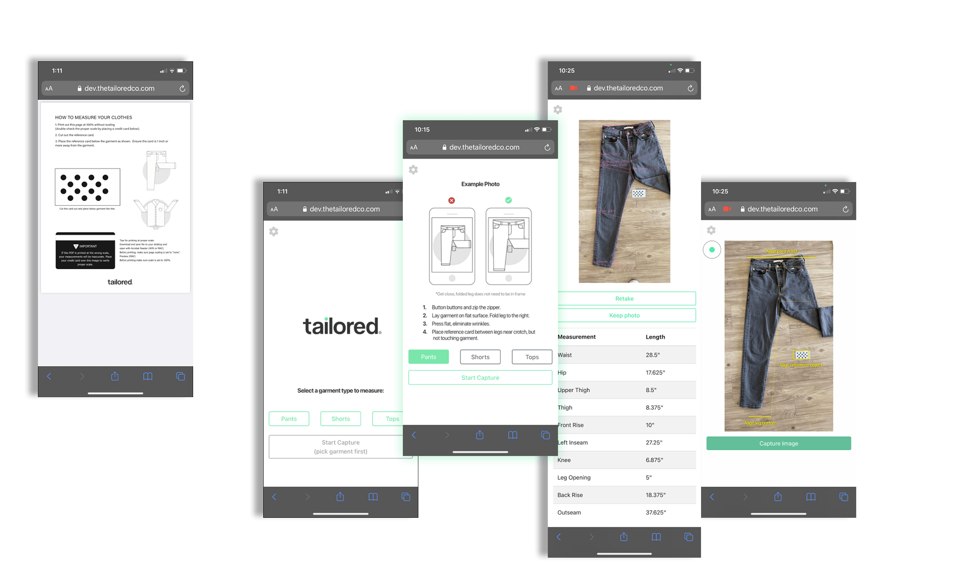
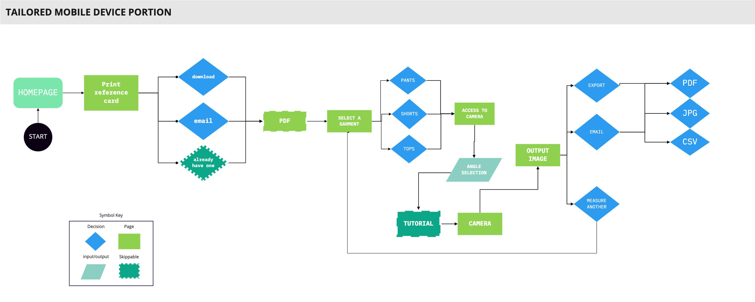
I was lead on testing the current platform for the target user persona, fashion industry individuals. During the session, I concentrated on the mobile web application portion of a few main tasks; printing a reference card and measuring a garment. I also wanted to observe how new users navigated the application, see what they felt about the interface (design, flow, etc), make sure all the instructions that they needed to complete the task were provided to them and easily understood, and get a better feel of the user persona overall.
My takeaways:
The users were getting very frustrated and losing patience with the interface on the current version. They were getting frustrated with the flow and confused by the instructions that were presented.
Main Insights Overall from Initial Research:
The output image needs to be designed with different colors and have measurement options.
The reference card page need to be better integrated into the flow
Instructions are a little confusing and need to be integrated more intuitively.
Iterations
We figured out what areas were of the highest priority to test and design.
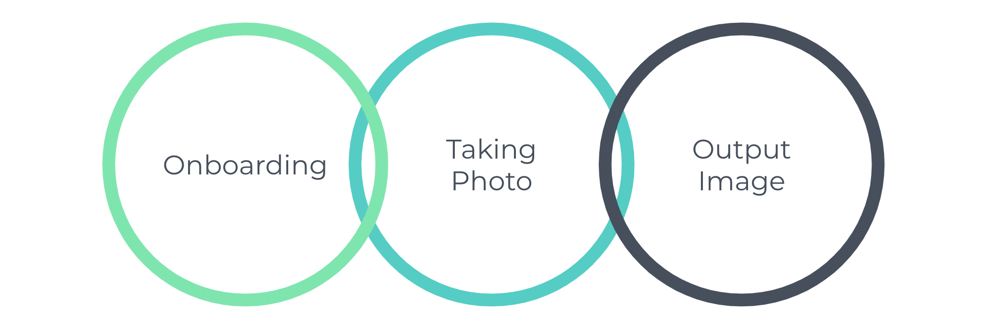
How focusing on the onboarding experience increased engagement on the mobile design.
Wireframes & Usability Testing
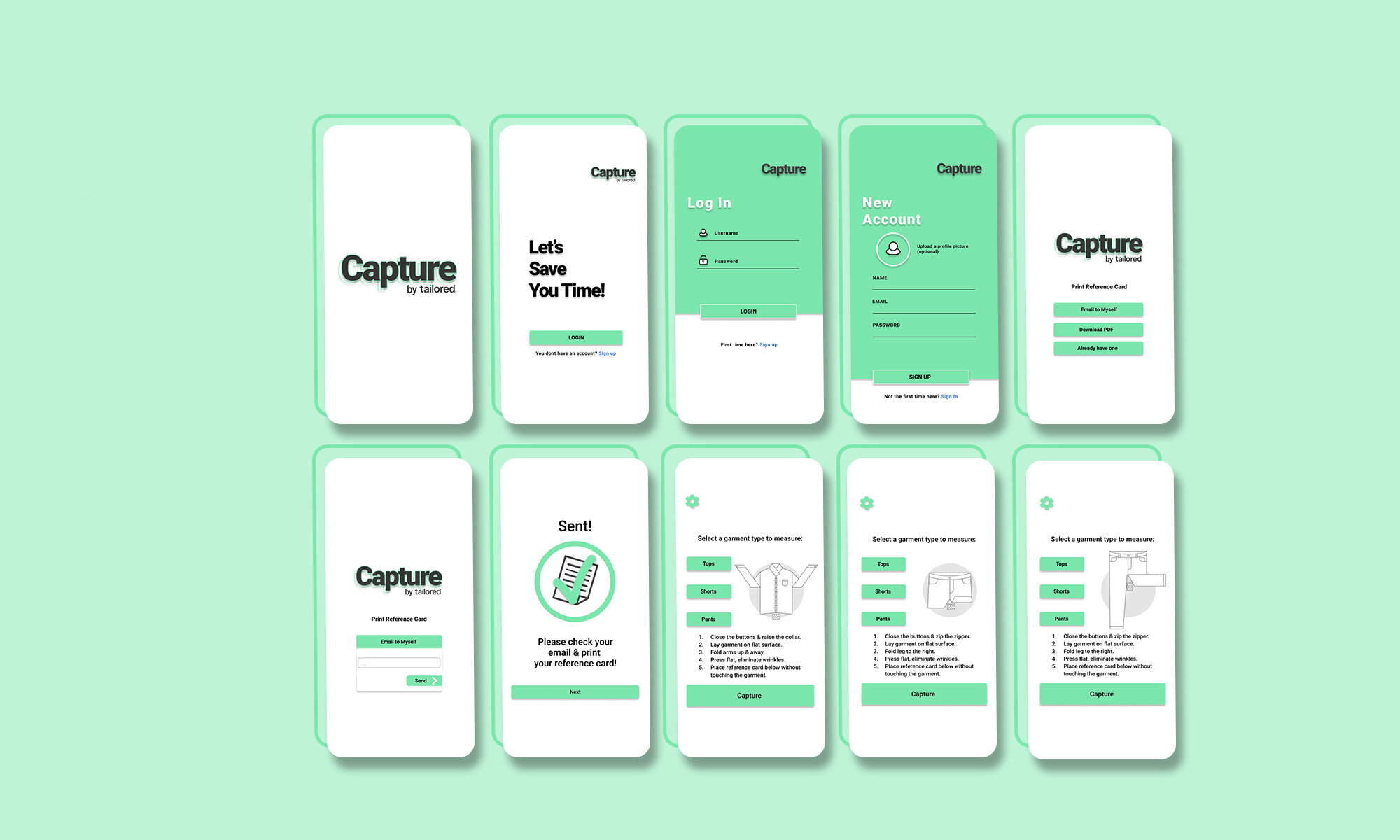
Key features that we integrated into the onboarding experience:
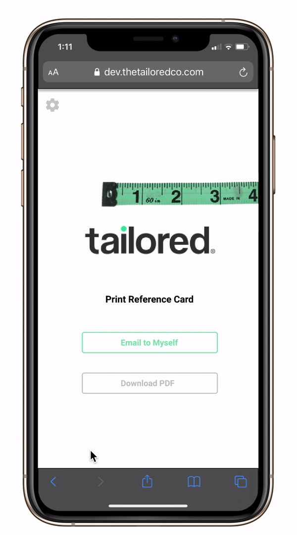
Adding the printing a reference card experience
Adding an option to email this reference card to yourself.
Having consistency in instructions
Make it a “fun” experience
Iteration 1
A couple of user issues
Kylie said
“The colors of the buttons are hard to read against the white.” She suggested a different colorway or more contrast.
Jacqueline questioned
if every time they open the app they will be prompted to print a reference card, suggested having a skip or an “I already have one” option on that page
Katrina mentioned
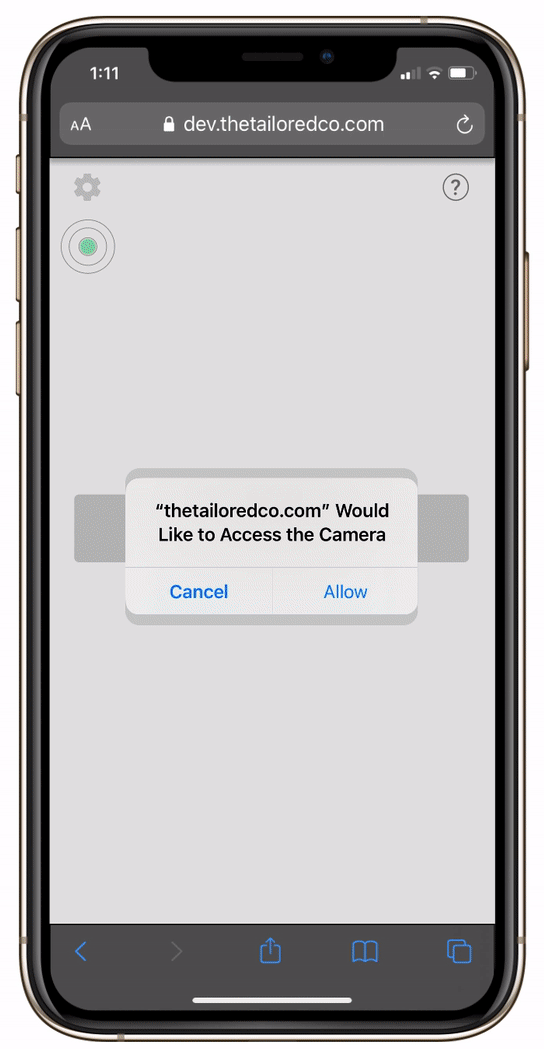
that the Capture button being greyed out confused her. She wasn’t sure to proceed because she thought the green buttons were more call to action.
Iteration 2
Findings
As we collected the data we designed the functionality of our wireframes. Every week we tested our latest designs with another group 0f users.
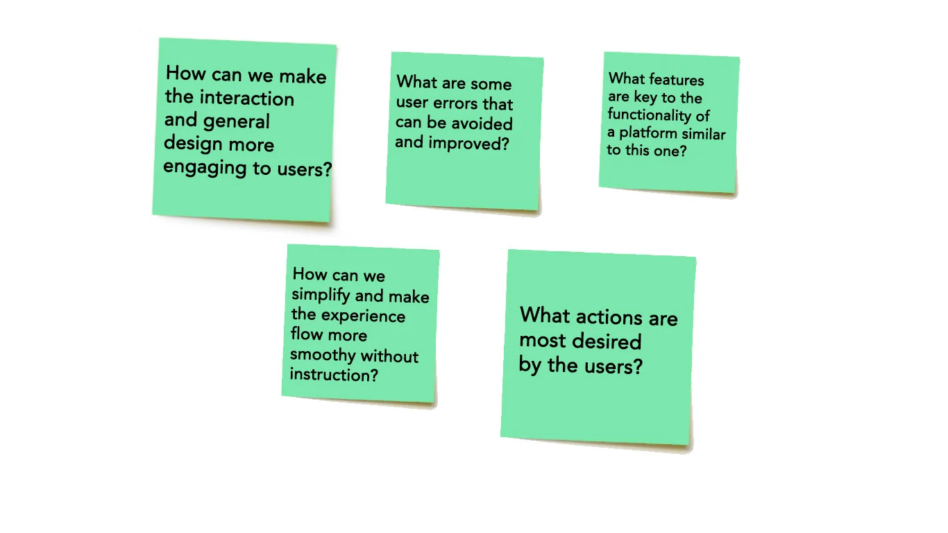
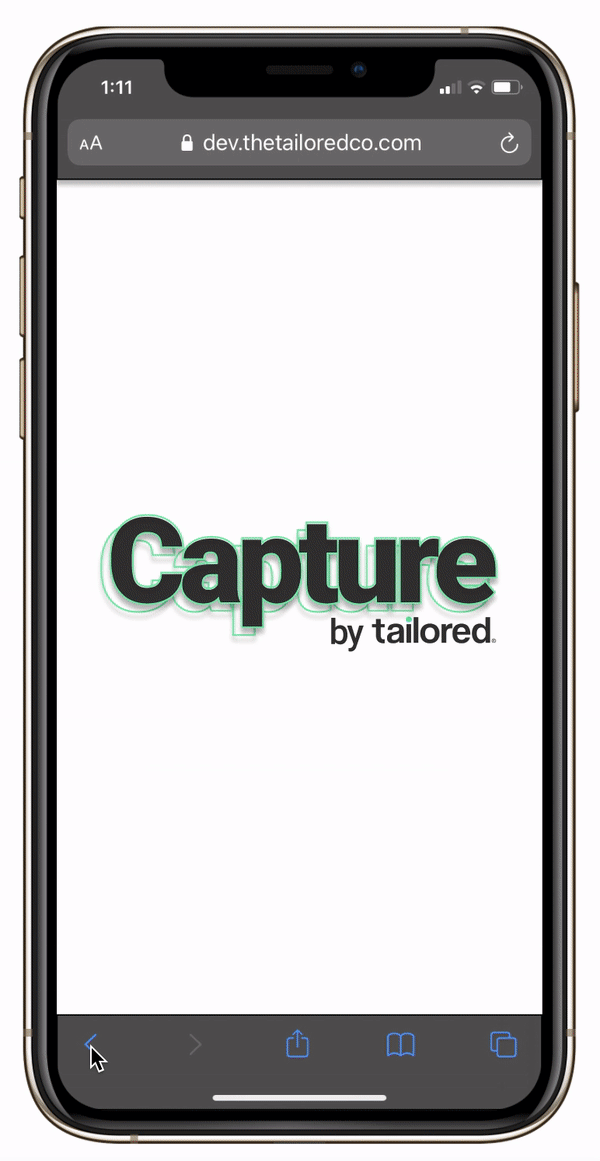
We found that the users were still confused by the photo-taking sections, and one question was not fully answered so far, “How can we simplify and make the experience more intuitive with less instruction?”
This led me to think
An instructional tutorial on the photo-taking page would help this issue.
There was also the lack of a sign-up/login page for new/returning users. (This could give us the opportunity to also potentially add in a tutorial in the onboarding later on.)
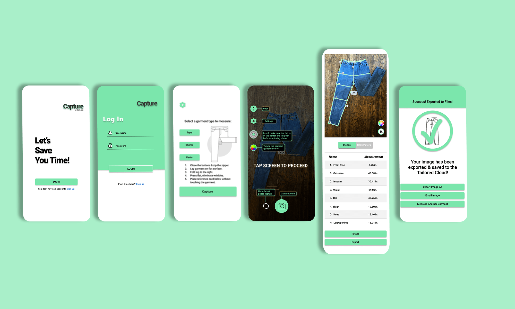
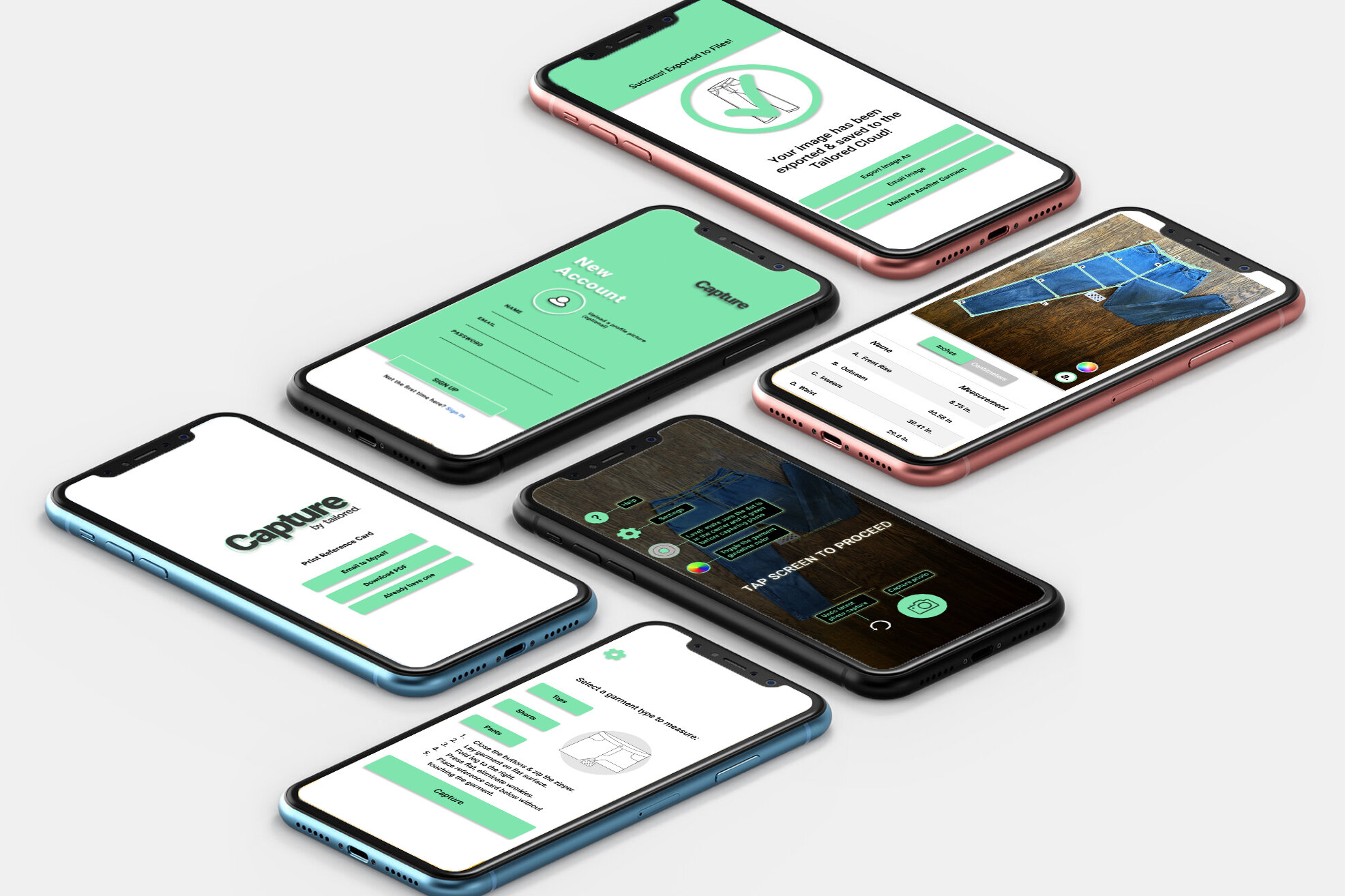
Final Design
The final designs allow the user to navigate swiftly without confusion as soon as they enter the mobile experience. A login/signup guides the user through the proper channels for their journey and allows you to skip portions if needed. This simple but visually dynamic onboarding creates a sense of fun throughout the rest of the screens. The use of helpful tools makes the overall application more useful. Along with the interactive experience paired with a pop-up tutorial when taking a photo eliminates confusion and abandonment.
Takeaways:
Icons were confusing to users
Printing reference cards from the website increased site abandonment.
Asking users to print something increases site abandonment.
Email options increased acquisition.
Boosting consumer’s confidence through interactive experiences increases acquisition and revenue.
Visual Design
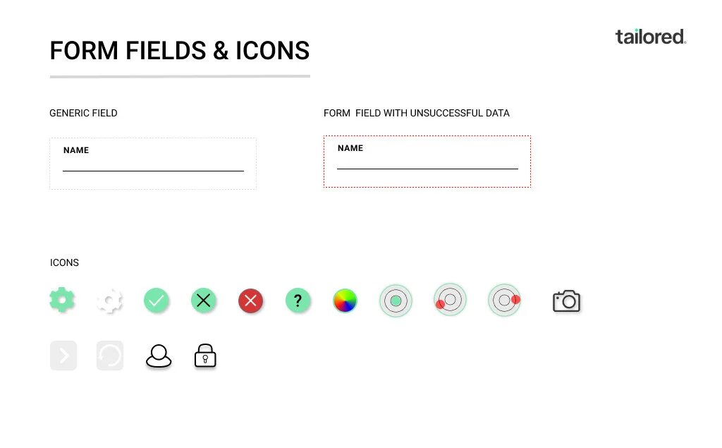
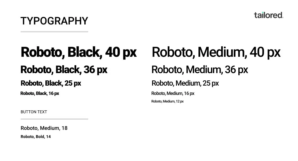
DESIGN SYSTEM
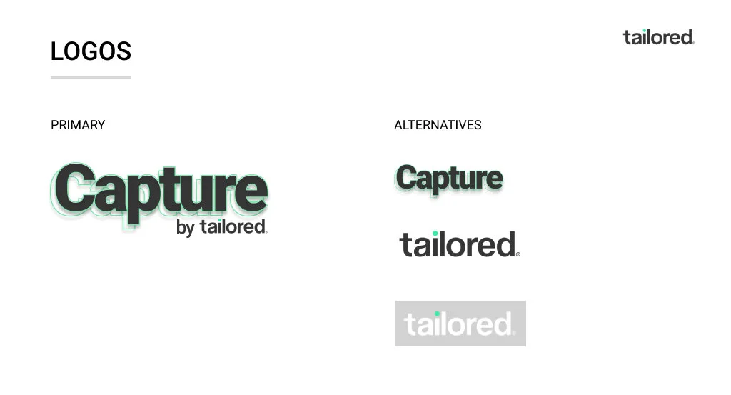
I started working on the Design System by auditing everything that was available in the Company folder on the shared drive provided. So, my first challenge was creating a logo specifically for their product under their brand, along with fixing the colors in their current brand logo.
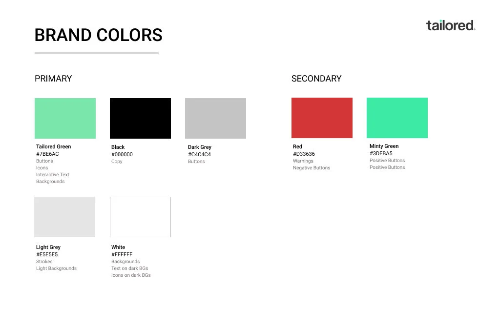
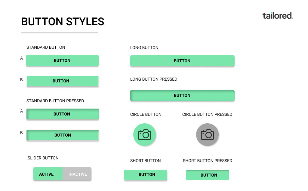
One of the things I wanted to be sure to build into the buttons was a little color and making the icons unique. With being mindful of accessibility and using solid colors with a black font instead of outlined buttons that do not have enough contrast for users.
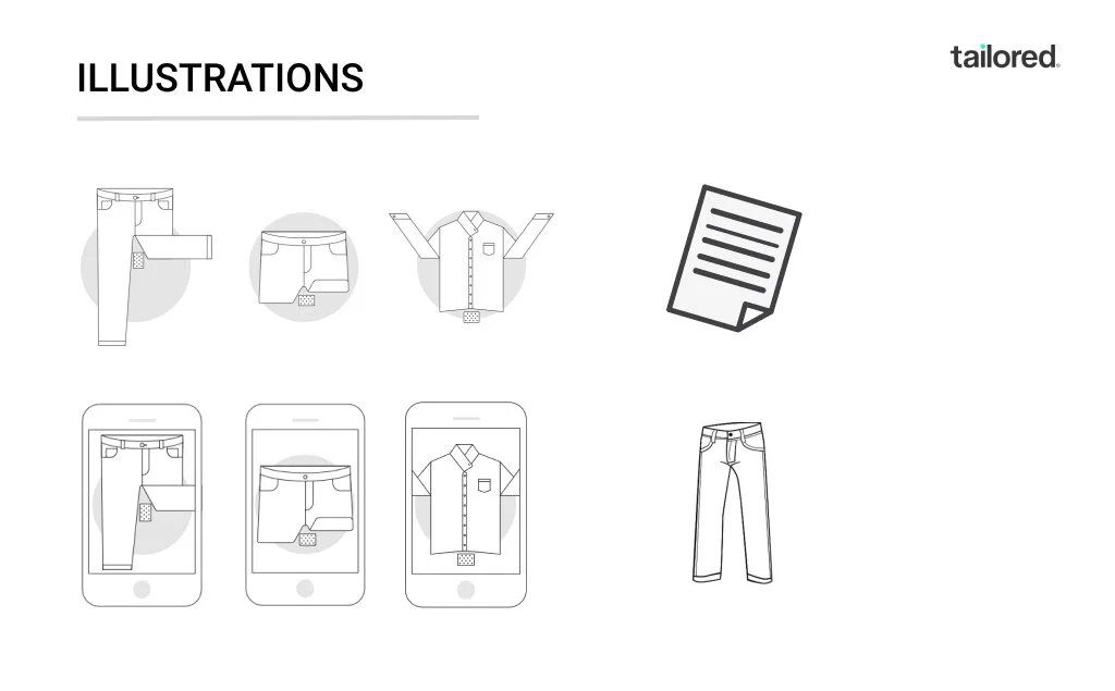
The original designer had created a handful of icons but with this redesign, they were redone to fit the new brand identity.