
Vicinity
Role: UX/UI, Visual Design
Tools: Sketch, Figma, photoshop
How transitioning a traditional social mobile application to a group & incentive-based hangout platform increased acquisition and reduces abandonment.
Vicinity is a product that helps people meet new friends. The goal of the product is to create a social user experience that will help users get out and do activities in person. Friends keep us company through the difficulties of our lives and help us grow, but when people move to a new city or town, fear and social anxiety can keep them from making new friends. How can we help people step out and make new friends?
My objective was to design the Vicinity mobile app from the ground up to achieve a seamless user experience. I identified potential users and found solutions to help people attend social gatherings, events, or hangouts wherever they are.
Vicinity is currently in development.
Finding a way for users to follow through with attending gatherings.
After a dive into the research, I knew that most users didn’t have any incentive to go to the invite and that’s where they “dropped out”. Finding a way for the users to follow through with this task was key.
Problem
I identified that the number of people who say they are going to hang out or meet up with each other is higher than the actual number of people who meet up.
I really wanted to increase the conversion of accepted invited to hangout attendees. The company’s location data shows that, on average, 20% of people who say they’re going end up actually there.
How do we apply incentive-based hangouts that are cost-effective?
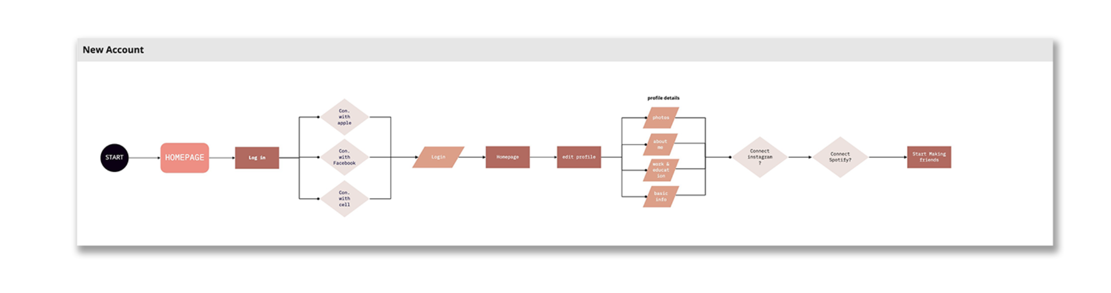
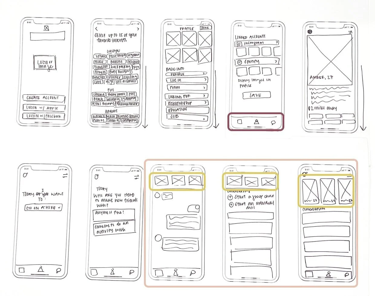
Sketches
The bottom nav bar (purple) is where I organized all the information to be found on the platform. This way it is easily accessed by your thumb and no need for a hamburger menu.
The conversation pages (pink) were very simply designed. I felt that if I did change it, that could change the user’s experience from intuitive to a bit frustrated.
The boxes located at the top of the conversation screens (yellow) are icons of your “friends” and people we recommend to the users based on a percentage of similarity in things you like.
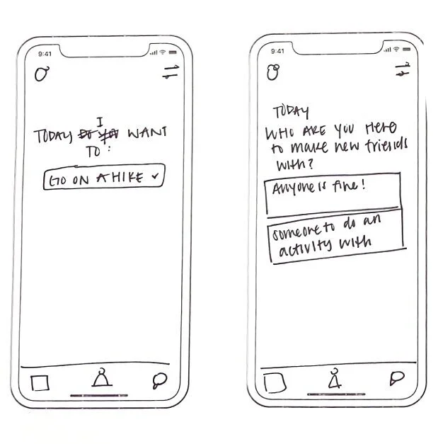
I wanted to focus on asking the user why they are on this platform. So that we can see what they want to use it for more specifically so we can pair them with like-minded individuals.
Design Iterations
I mapped out the functionality of the screens with the wireframes and got feedback from multiple groups of people. After testing I went into high-fidelity wireframes, I was able to quickly identify early issues that need to be designed differently while giving the user a realistic experience during the tests.
Style Guide
The style guide that I created for Vicinity included a color palette, icon set, button design, and illustration library. Everything that was chosen was to make sure that the app felt fun, friendly, and light.


Features
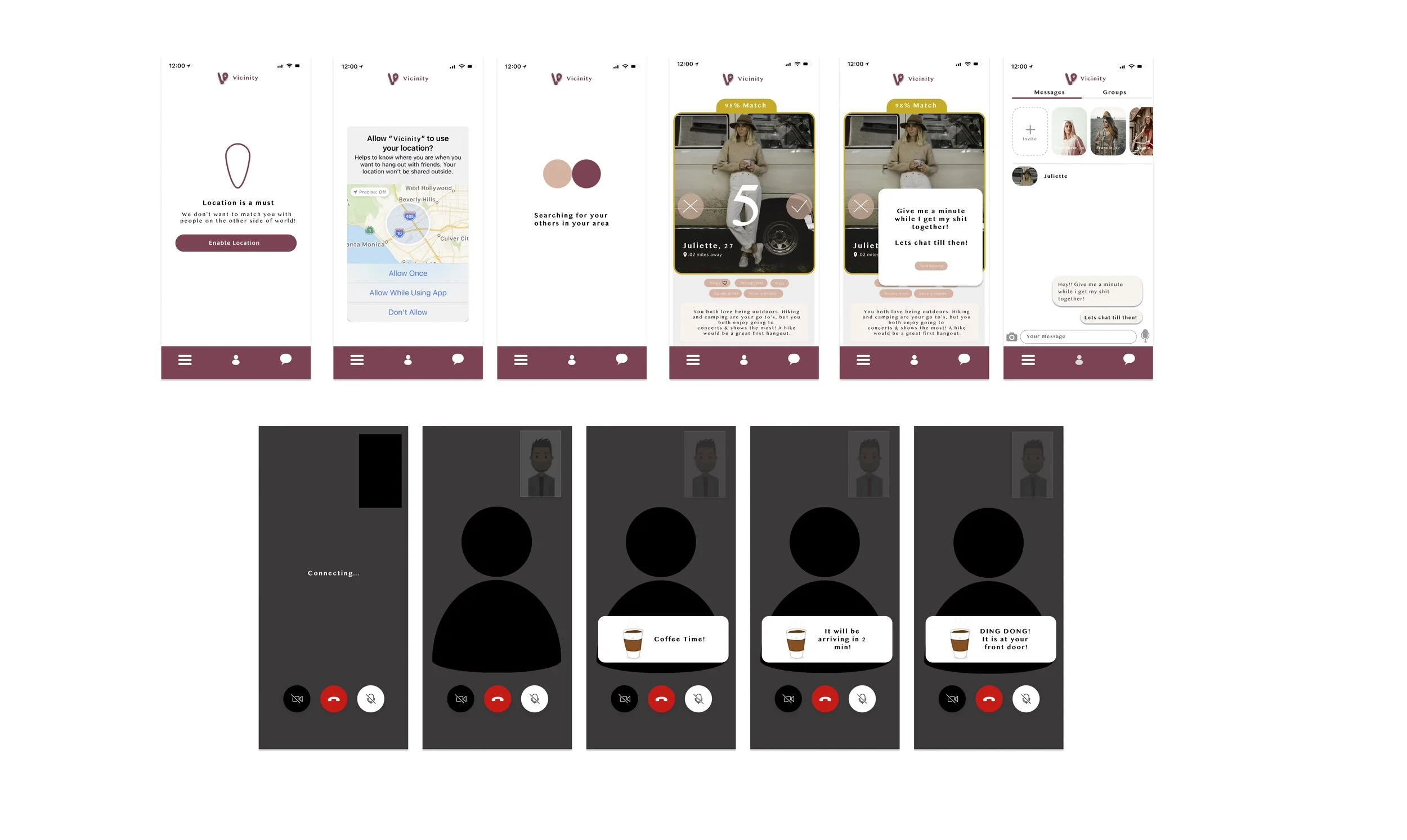
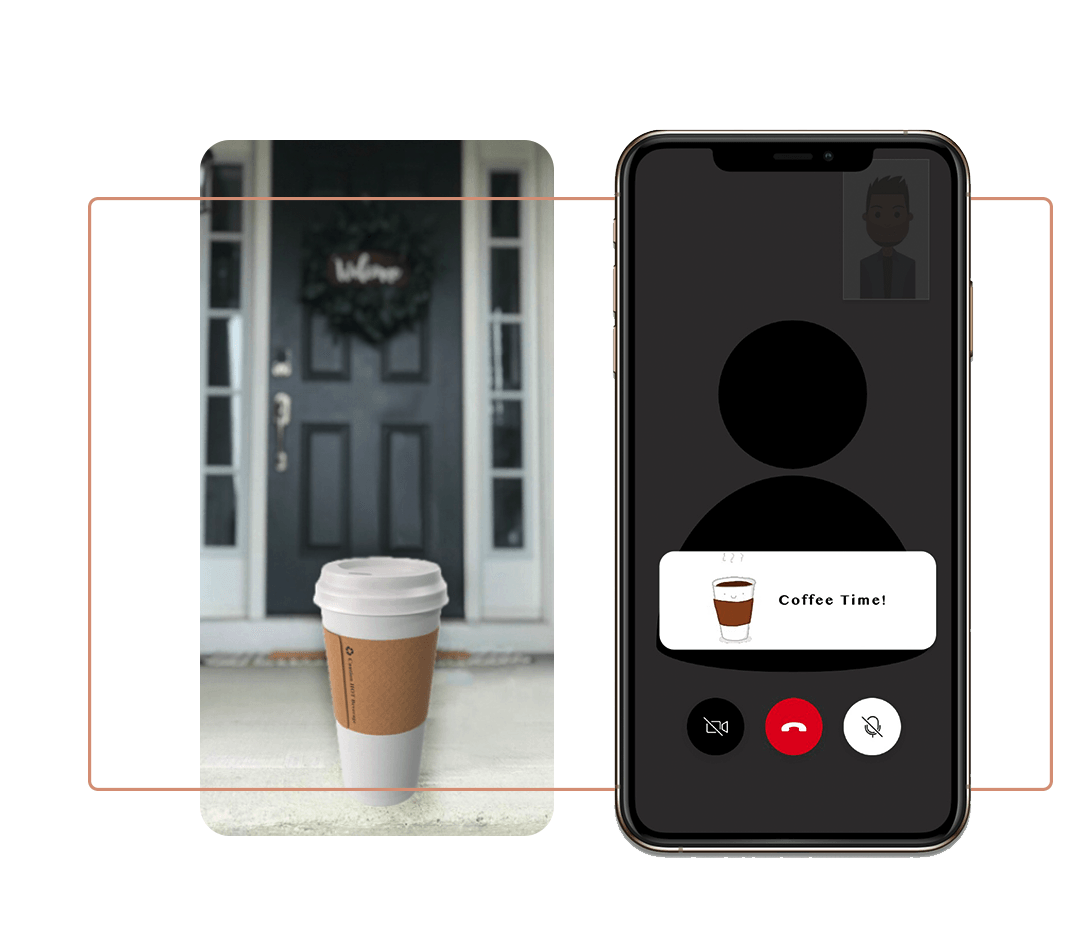
Video Call & Coffee Delivery
Incentive Marketing User Test
I wanted to test a user incentive experience integrated into a video portion of the platform. Realizing that users were already a little apprehensive about a video call right off the bat, I believed it could be a great opportunity to make the user feel more comfortable. Offer a coffee 5 to 10 minutes into the call and have it delivered to both user’s doors from a local shop! This not only makes the user feel ‘special’ but it motivates both to talk about this experience they had with their groups of friends. This experience was a successful cost-effective marketing incentive to draw more users to continue using the chat.
During my testing, all users but one enjoyed the coffee idea. The one who didn’t enjoy it said that “it was unique but does not think that it should be integrated as a primary function forever.”
I did some further research and spoke with local coffee shops to see if they would be open to this idea and they all thought it was a great idea and something they would be very open to discussing.
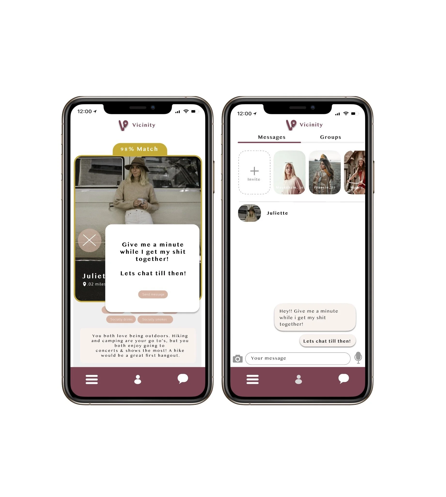
Chat Option
Alternative to Video call right off the bat
Upon clicking the X button you are prompted to chat while you get your life together. This will send a message to the user you are talking to. Having this feature allows the user a little leeway without giving them a complete out. The platform will then ask you to make a call or schedule one. You will have 24 hours to make a call or you lose the connection.
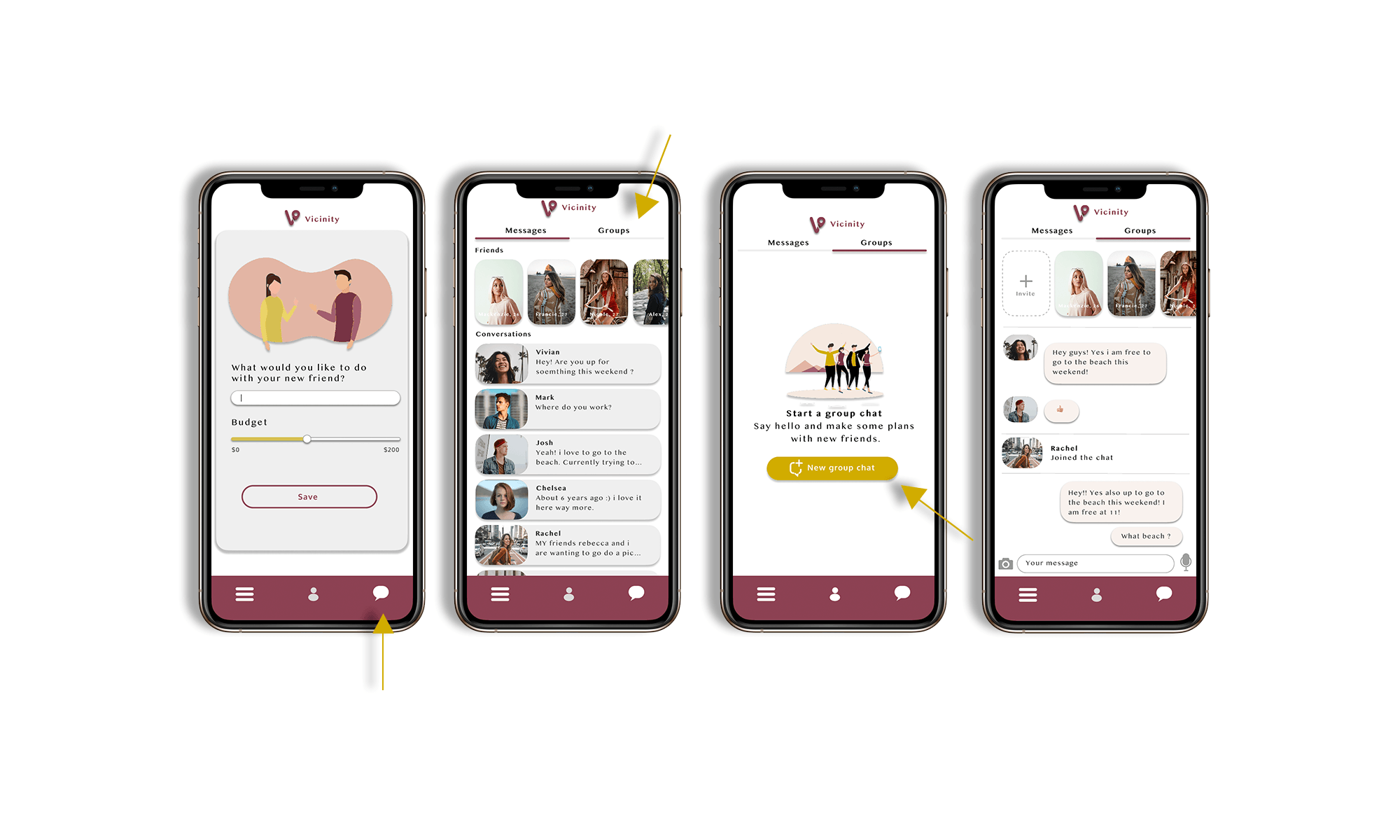
Group Chat
This feature was tested on multiple rounds and ended up being one of the favorite parts for the users. The ability to have a group chat instead of a solo chat with new people increased acquisition and I saw that people really were less hesitant about going to a meet-up.
Final Design
The final designs allow the users to not only see all the information about their potential friends but also not waste time and go straight into an immediate call. The simple navigation and intuitive design with group features make it an app for all! This social user experience will help users get out and do activities in person.
Friends keep us company through the difficulties of our lives and help us grow.

