
Net Positive
Role: UX/UI, Visual Design
Tools: Sketch, Figma
How making job hunting personable increases engagement
Net Positive is a purpose-driven platform that not only looks great on a resume but is more intimate and allows individuals to pair with small to medium-sized companies to create a more net positive impact. Putting more back into society, the environment, and the economy than they take out.
Designed to create consistency and take the complexity out of matching startups and industry professionals to work together on projects.

Situation
In the midst of a pandemic, a significant amount of friends and family either lost their jobs or could not seem to find one. There was a 50% increase in the number of remote workers in 2020.
How might we take the complexity out of matching startups and industry professionals to work together on projects?
I wanted to focus on complexity. Let’s just think about how much easier it could be to personalize and take out the difficulty in finding skills-based work.
Everyone has had a hard time trying to find a job at one point in their lives. There are just so many hoops one needs to jump through just to get your resume seen or just an interview. The complexity can make it seem unattainable or deafening at times.
Searching for a job shouldn’t be this way.
Target
Net Positive was designed to target industry professionals, from Ages 22-45, that use websites or applications to find job listings and has expressed interest in working with a small to medium-sized company. It also targets the companies that need help and is searching for industry professionals to work on a range of jobs from short-term to full-time roles.
Research
Screener Survey
As a part of my Primary research, I recruited participants through a screener survey that was sent out. This was live for a week and interviewed roughly 10 people.
Interviews
The people who were interviewed fit the primary characteristics of the ideal user. I asked them a variety of questions and mainly focused on understanding their want, ability, and way to find a job.
Empathy Maps & Personas
With all of this gathered information, I went ahead and created an affinity map, empathy map, and personas!


Insights
People wanted to be able to engage in a group hangout/chat.
People were very particular about their page and how they are seen by others. An effortless profile experience will make for the best engagement.
People tend to not use apps to make friends because they don’t think it will work.
Ideation
I started mapping out the functionality of the screens through the user flows of the application. By starting with this we were able to create a rough outline for everything that was going to be included in the platform.
The components that I wanted to apply to assure that the app would be successful:
ease of use
simplified experience

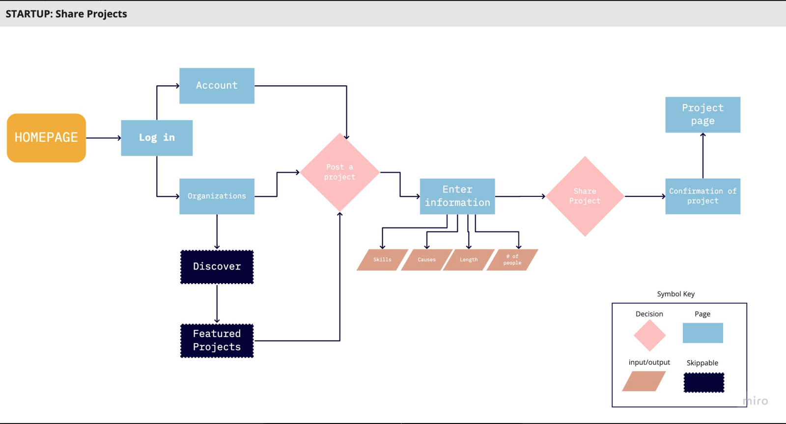
Start a New Project User Flow
With this user flow, I wanted to focus on the main user process of applying for a job. This is the main journey one would be going on from start(logging in/signing up) to applying to the project.
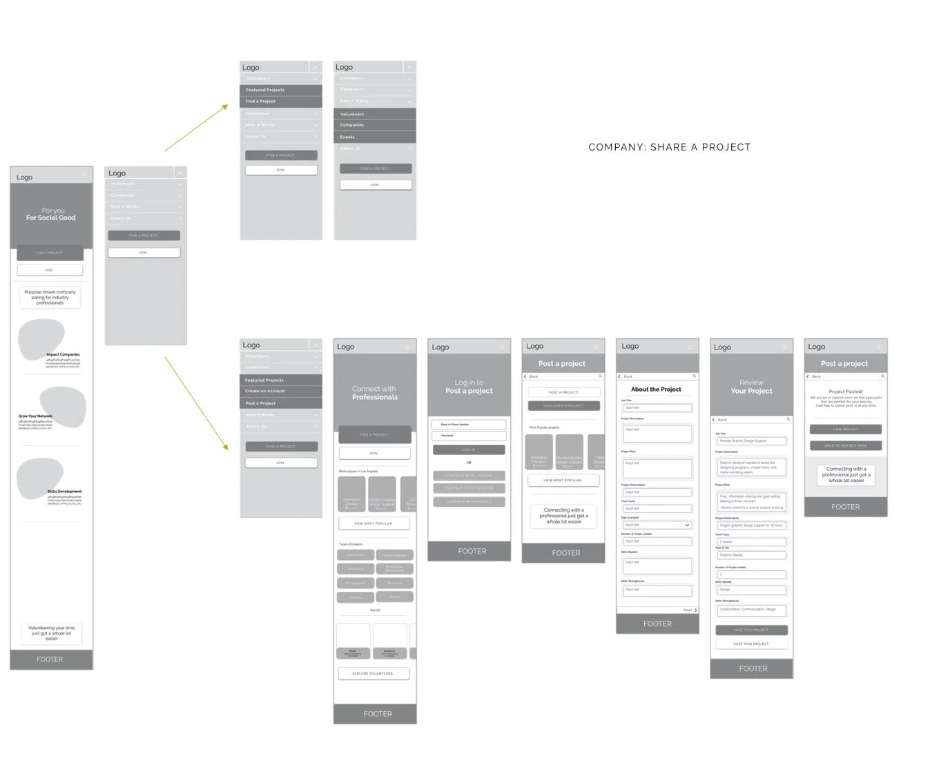
Post a Project User Flow
This second user flow focuses on the Companies posting and managing their job postings on the application. This is the most basic process of posting a project, entering the information, and then waiting for the applications to flow through.

Sketching
Early hand sketching allowed me to gain an insight into what layouts I wanted to work with and what designs did not aid in the user experience I wanted.
Guerilla Usability Testing
Hamburger Menu
As they went through the red routes, most users really just wanted everything easily accessible. They wanted to visually see it on the screen along with the option to see it on the Hamburger menu.
I noticed that all of the users used the hamburger menu for most of their navigation over “clicking” on objects on the page. The users did understand the primary purpose of the site when they clicked on the hamburger menu and deduced this from the options- “Volunteer” “company”.
Solution
I decided to put clickable buttons on the page rather than having everything in the hamburger menu and make everything more clear. This round of testing brought a lot of basic functions necessary to light and made me feel like I have to proceed to some low fidelity wireframing and test again. I felt that this method was good to see how users think and a great first step.
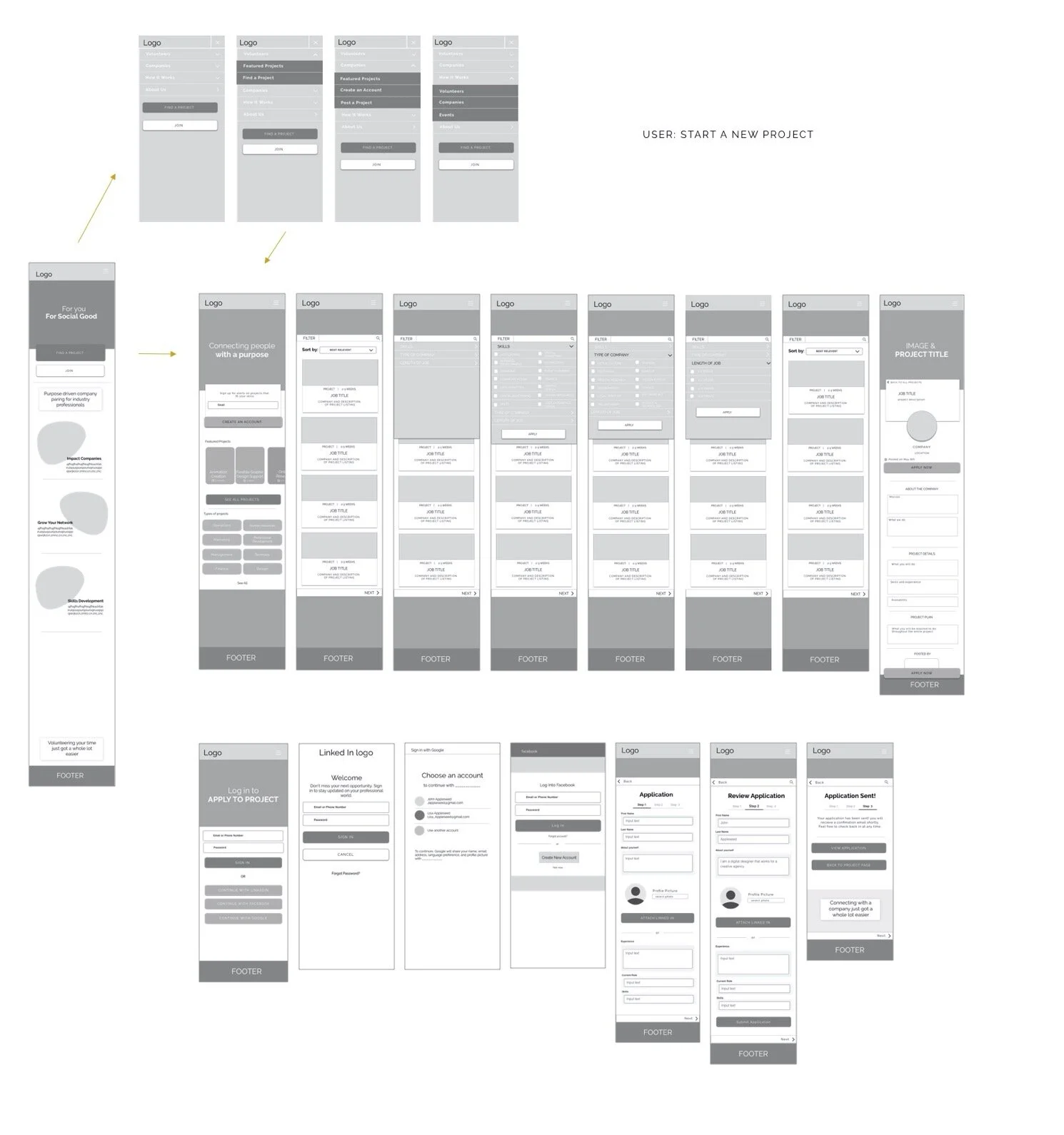
LoFi Wireframes
When I went into designing the first set of wireframes, I took my hand sketches and digitized them in the simplest way.
Since I was able to guerilla test the sketches before entering this phase of the design process, I made the appropriate adjustments based on some of the findings that made it more user-friendly and functional.
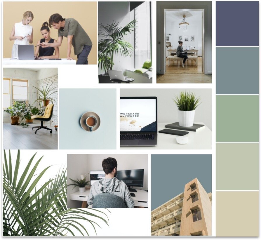
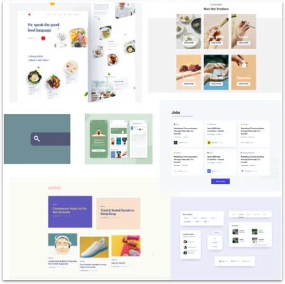
Brand platform
Right before designing the high-fidelity mockups, I created a brand platform, including the logo, colorway, icons, and inspiration for the company. This Visual branding helped keep the designs cohesive.


Main Features
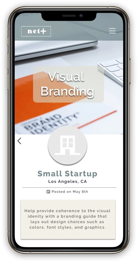
Job Listing
Have an easy way of viewing the job posting with everything you would need without a lengthy read.
Easy access to the LinkedIn of the person posting it, project details, and the skills needed.
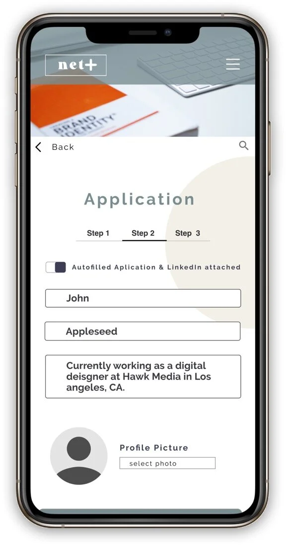
Smart Autofill
Have your application auto-filled based on your linked-in or personal account?
Saves you time and energy for more important things.
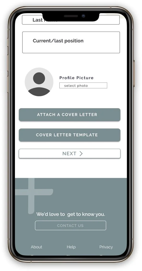
Cover Letter
Attach a Cover letter quickly or use our template to help you get the application done as swiftly as possible.
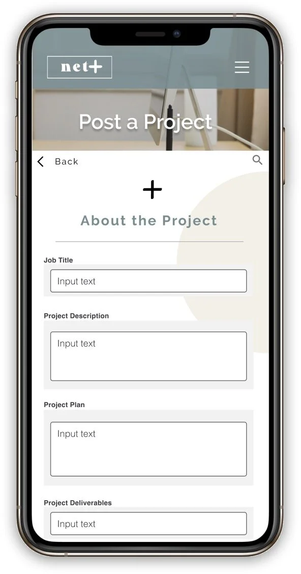
Job Posting
A very simple way of posting a job for your company.
You fill out all the information and we make it look good.
Testing
I performed two rounds of remote moderated testing with individuals via Zoom.
Research questions
Can users find a project easily?
How do participants respond to the organization of the Home screen UI?
How do participants respond to filling out the project details and the length of it?
How do participants respond to the individual homepage UI?
How do participants respond to the UI upon viewing the Homepage? Colors? Layout?
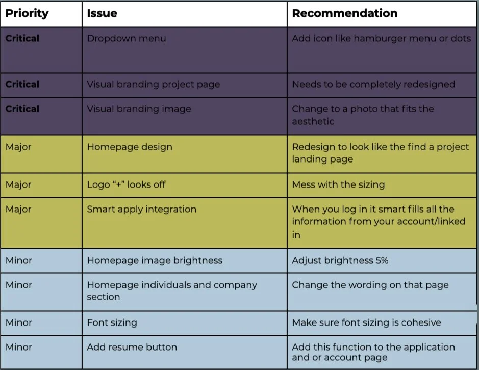
Round 1
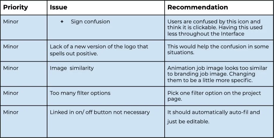
Round 2
All of these issues can be easily fixed and wouldn’t necessarily require another round of usability testing because I feel confident that the prototype will accurately reflect my participant’s feedback after this iteration.

Final Design
The final designs allow the user to quickly navigate and see the job postings that are up or post a job posting with smart filters by clicking a few buttons. The simple navigation helps create consistency in your job search and takes the complexity out of matching companies and industry professionals.